


Continuous discovery & realtime research for product managers, designers, and marketers


Companies getting answers
“The business is very customer-focused, and customers are always continuously changing their minds or adjusting their requirements.”
“We live in a democracy. Every vote counts toward electing the government that we believe in.”
“(1-5) I like variety and use different scents for daytime or bedtime.”
Ask a few questions at a time to a targeted research panel. Get insights when you need them, at any stage of your project, without sinking your budget.


Get immediate answers from real users. Create and share usability tests, and collect valuable insights throughout your product’s life cycle.
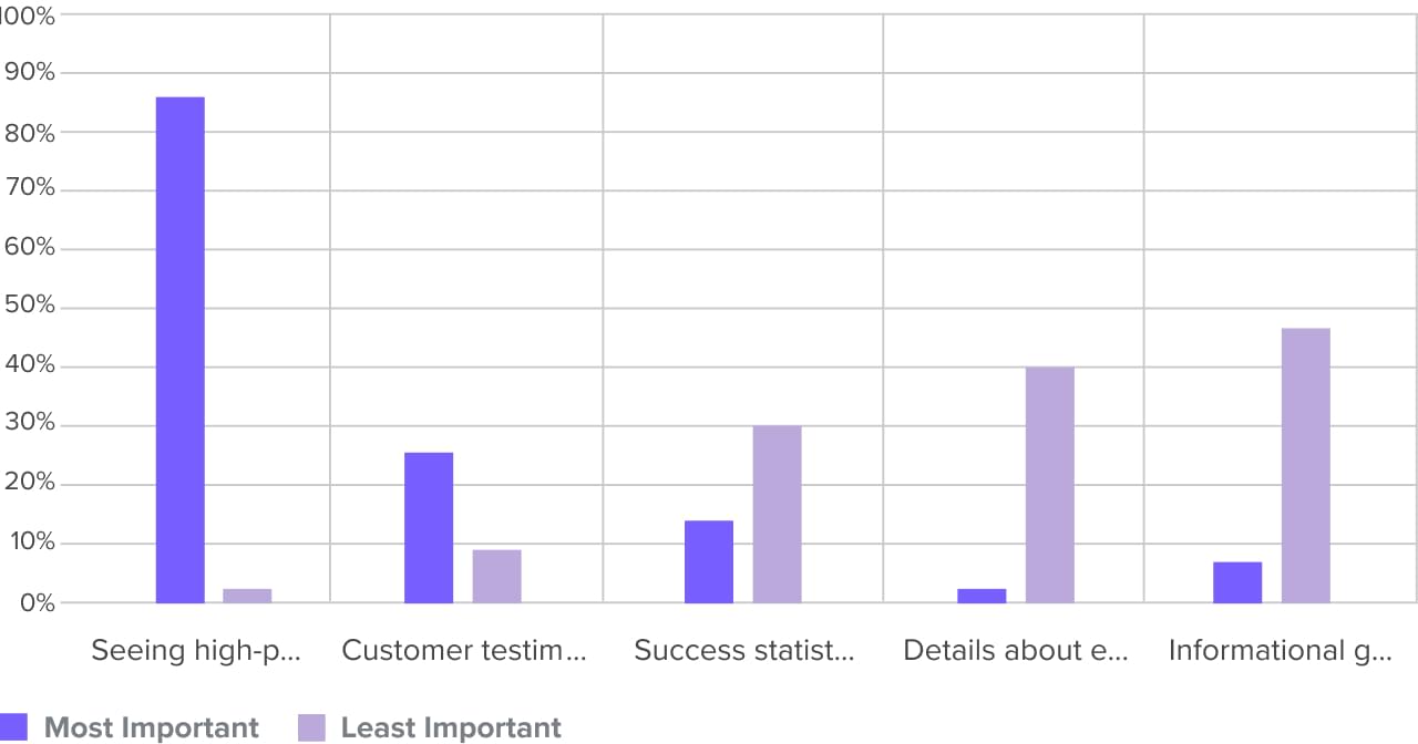
Use Ranking in your creative process to understand how your audience prioritizes options in different situations, from feature concepts to orders of operation.
Get a quick and easy read on the ideal list order your audience places ideas into.
Map out your customer’s user journeys based on the preferred order of operation for an audience.
Find a few key ideas that your customers can’t live without. Perfect for your MVP!
Understand the extremes of how your audience feels about your creative work. MaxDiff gives you a look at the best and worst parts of a group of ideas across an audience.
Discover which concepts or features fall on the ends of a spectrum for your audience.
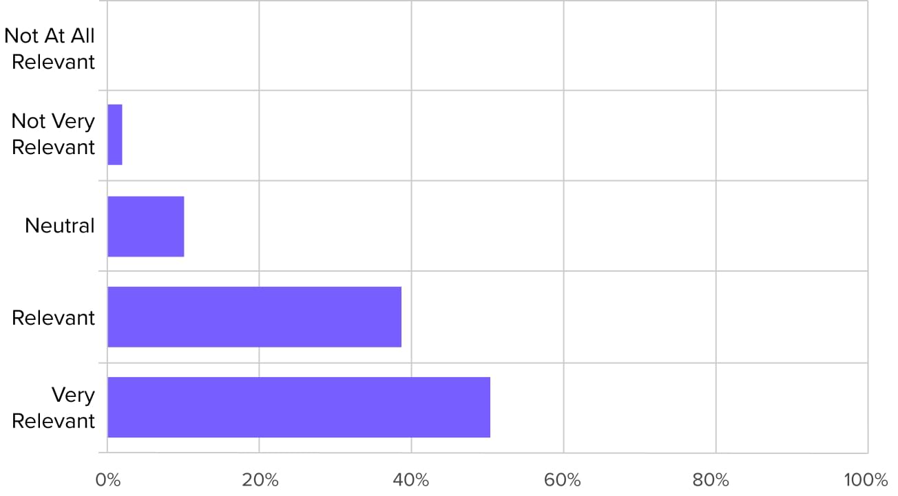
Gauge which options on your list are falling out of favor with your audience.
Find a few key ideas that your customers can’t live without. Perfect for your MVP!
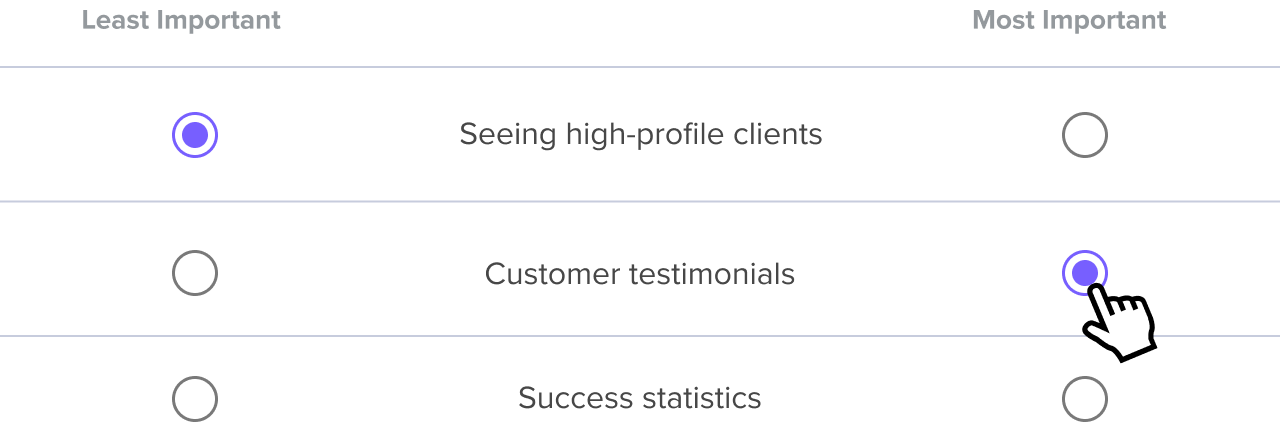
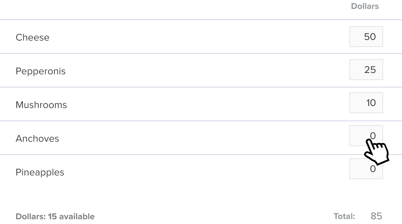
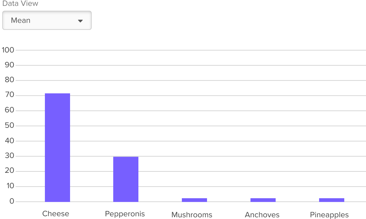
Use Point Allocation in your creative process to discover the relative importance of options in your list, so you know just how strongly your audience feels about one idea over another.
See the ideal order of a list of items based on an audience’s prioritization.
Uncover how options are prioritized over each other and see the relative difference between 1st, 2nd, and 3rd ranked items.
Assigning points allows you to see the complex feelings your participants have towards the items on your list.
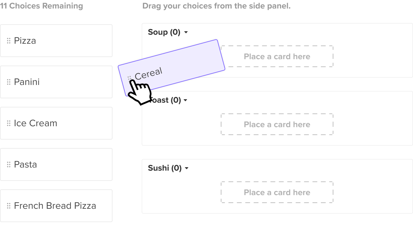
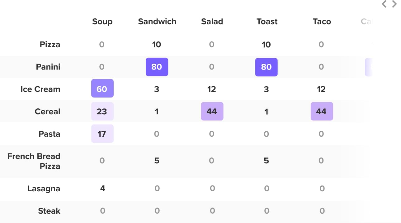
Use Cart Sort in your creative process to understand how an audience groups concepts. Figure out the mental models of your customers.
Plan out a mega-menu or complex navigation based on where participants group information.
See how an audience reacts to your product experience by having them group ideas.
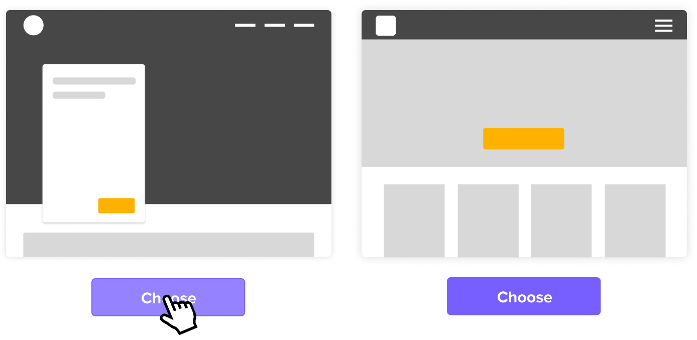
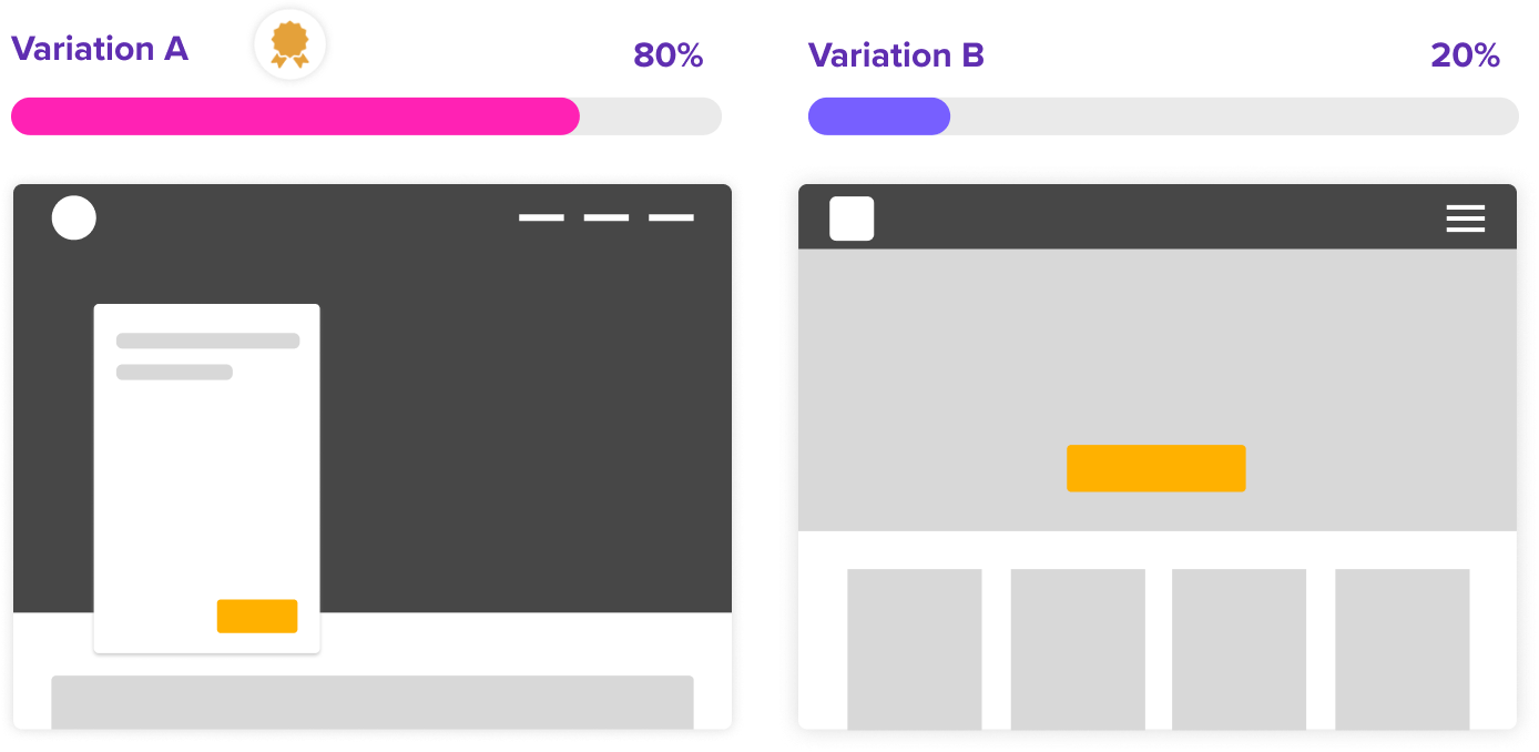
Collect gut reactions from participants on core visual elements or products. This is great for settling whether one direction is more effective than another.
Get answers and draw actionable conclusions from two or more variations in minutes.
Get focused reactions specific to a single variable or element.
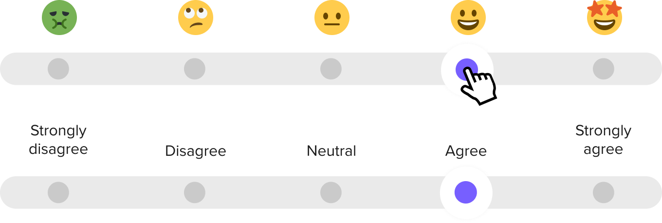
Measure participants' reactions on a scale of your choosing. Ask your audience to gauge the importance of ideas, like new features to introduce into your business.
Likerts are an easy question type to set up and even easier to take. Get answers and draw actionable conclusions in minutes.
Get information about how your audience thinks, what they prefer, and what their perceptions are about your company.
Test specific moments within any user journey and get participants to share how they felt about an experience.
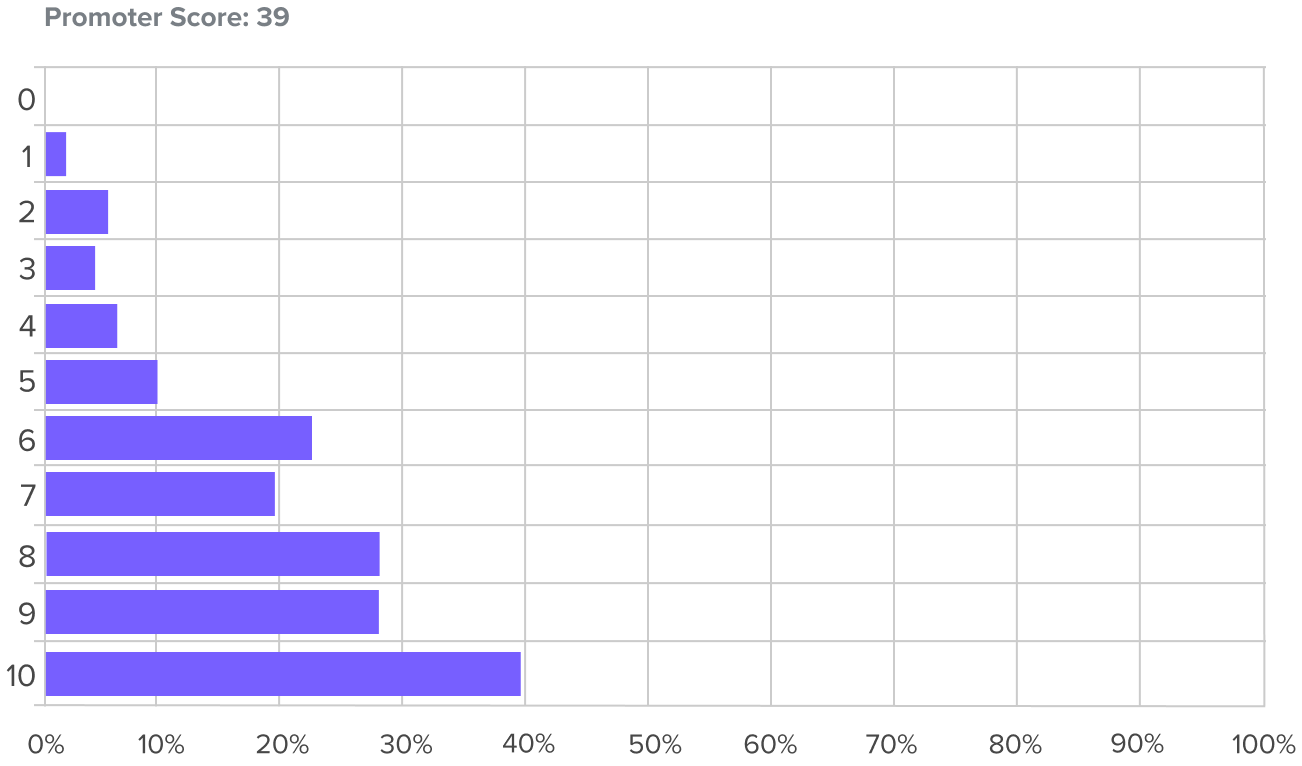
Get powerful quantitative feedback by asking participants to rate the likelihood or importance of actions on a simple 10 point scale.
Get answers and draw actionable conclusions in minutes.
Get focused reactions specific to the types of feelings or perspectives you feel are important.
Test specific moments within any user journey and get participants to share how they felt about an experience.

Find out how participants interact with early concept designs or production-ready screens. Validate micro-moments within a flow to create building blocks for improving any experience.
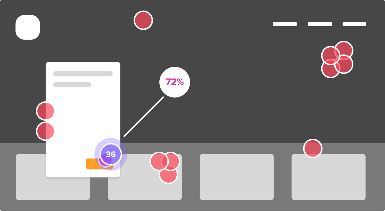
Find elements on your page that catch a participant's eyes first. Click maps in the report reveal patterns immediately.
Discover where your information hierarchy needs adjustments based on how people react to specific directives.
Figure out how people move through a series of click tests you string together using clickable hotspots.

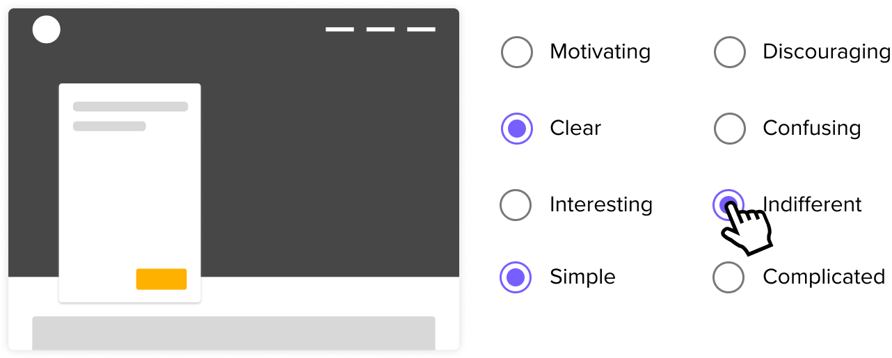
Understand your audience’s choices from a variety of specific options, such as behaviors or impressions in a specific scenario.
Get answers and draw actionable conclusions in minutes.
Multiple Choice can be a great tool to get more information about your audience in how they think, what they prefer, and what their preferences are.
Have a quirky hunch you want to get out of your system? This is one of the fastest ways to validate or invalidate it!
Have participants share things they care about or learn how they think about your creative ideas.
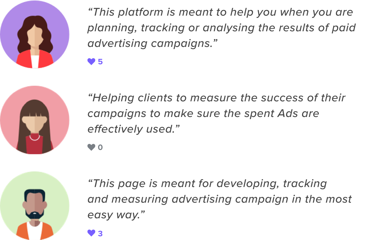
Listen to participants grievances outside of customer support.
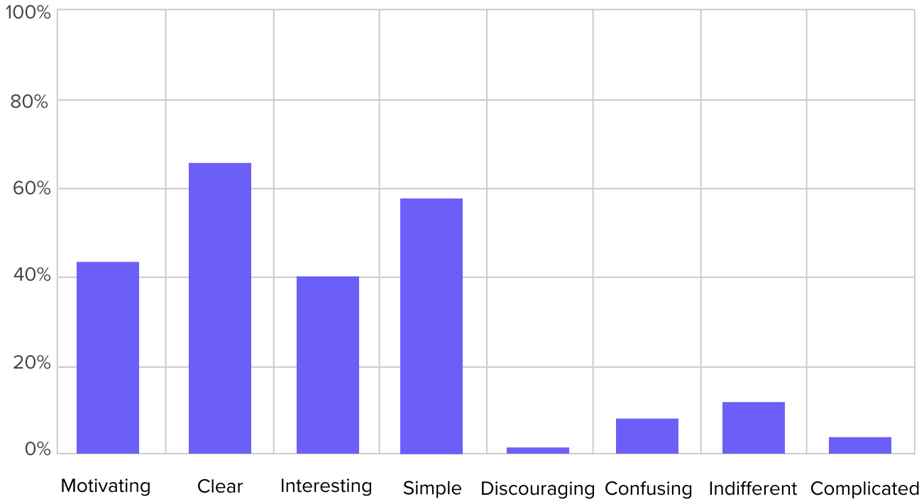
Gauge comprehension of ideas and designs from people. With our automated sentiment analysis, it's quick to interpret the data.
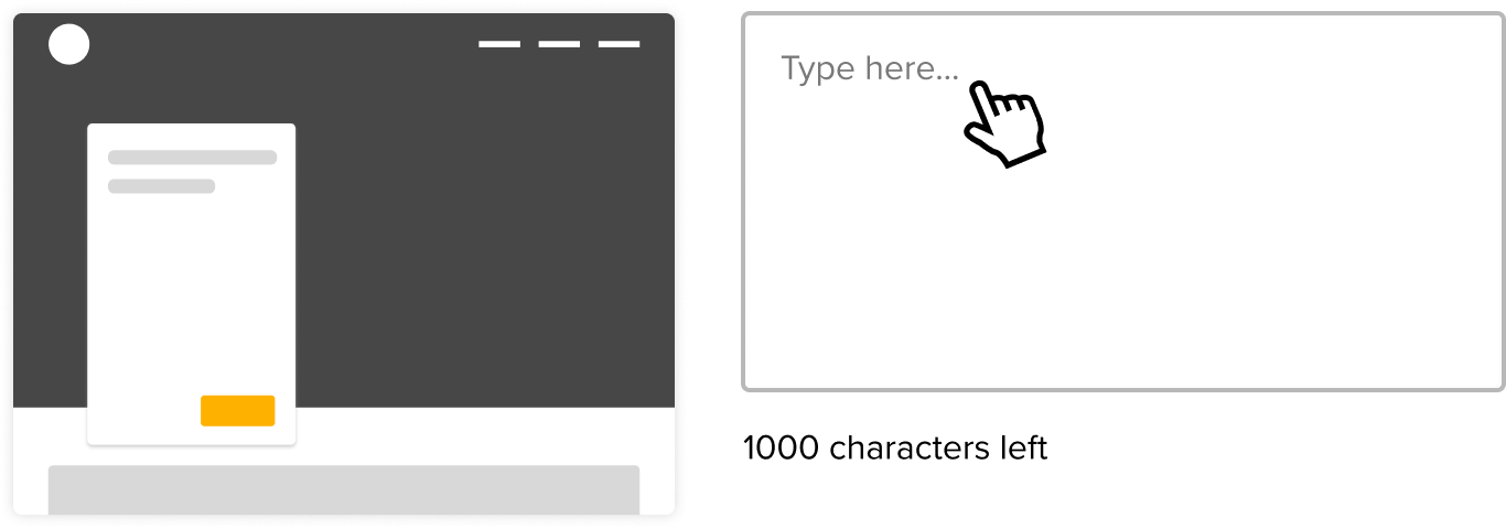
Ask participants about their daily routines, their hopes and fears, or simply their preferences. Let them go on a tangent - you never know what you'll discover!
Subscribe to Closing the Gap. A newsletter to help makers and doers get closer to customers. Learn more.